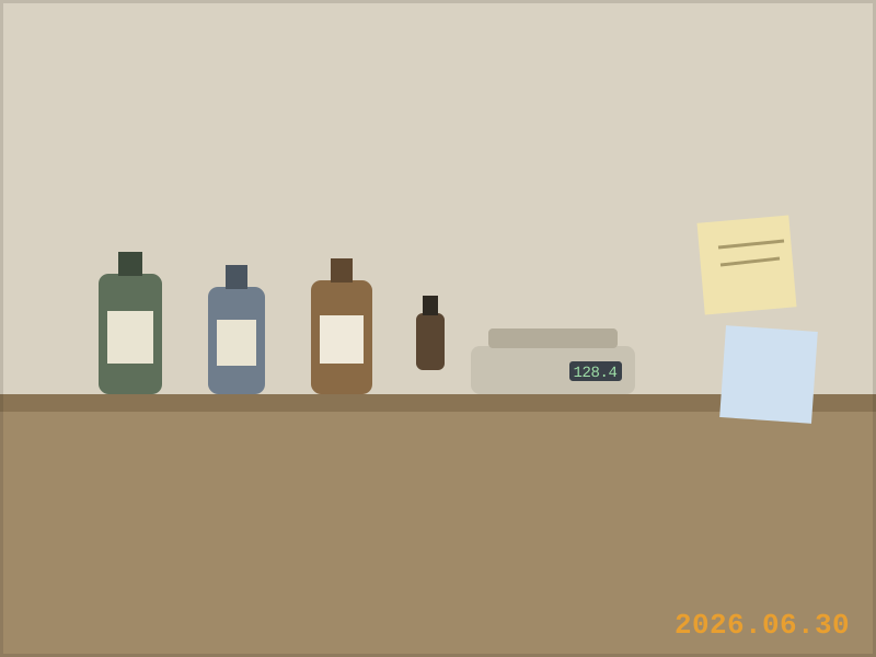
We spent most of June making the bottle look more expensive. Heavier cap. Softer matte finish. The label went through eleven rounds, each one removing words until it was mostly negative space, which is what premium means now: paying extra for less information.
Then I brought the prototype to a shop owner on Anfu Road whose taste I trust, and she turned it over twice and asked:
"Would you feel bad using this next to a dirty pan?"
I started answering and stopped, because the honest answer was yes. We had designed something you would feel bad using. A dish soap. That you would feel bad using. Next to dishes.
Premium design keeps promising you a life where nothing gets dirty. But we sell things for the part of life that does.
This is the trap, and half the industry is inside it. The visual language of "premium" — the weight, the matte, the whisper-quiet label — is borrowed from perfume and skincare, categories about aspiration. But home care is not aspirational. It is repetitive, wet, slightly annoying, and completely necessary. The design job is not to elevate the product out of that context. It is to belong there with some dignity.
So we walked it back. Not to ugly — to sturdy. The new direction looks like something a good hardware store would sell if good hardware stores sold soap. A label you can read with wet hands from a meter away. A bottle that looks right with suds on it. Ink that will scuff, in the way a well-used thing scuffs, instead of a coating that chips, in the way a disappointing thing chips.
The unresolved part: sturdy photographs worse than premium. Instagram rewards the matte bottle, and the algorithm does not wash dishes. We are choosing the customer's sink over the feed and hoping that is the long game. Ask me in a year.